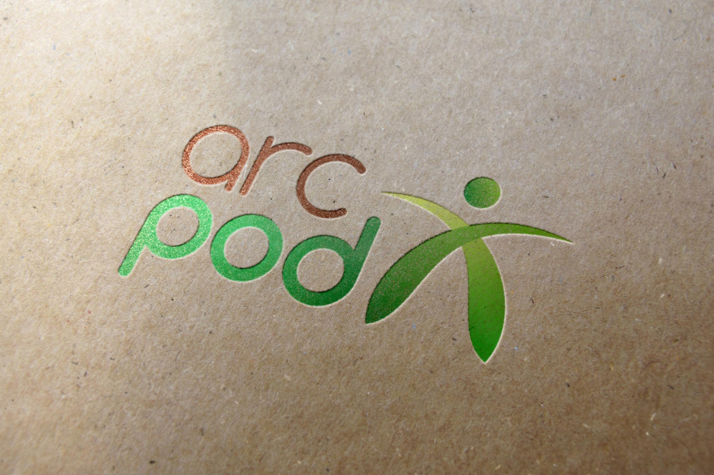
Arcpod are an organisation which is currently creating a low-impact, timber framed straw bale house in a small village in France. They offer consultancy services for people wanting to do similar economical building, as well as accept volunteers to help their project.
The colours of the logo were obviously first and foremost representing their green and economically friendly message. As their name 'Arcpod' was had many 'rounded' letters within it, a 'round' font was used to suit them. This also delivered a more open and friendly identity to the logo which emphasised the informal nature of the company. The icon was a mixture of two 'arc's meeting and forming the shape of a person, signifying how the organisation involved volunteers to make a unified entity.
The Client
More Projects
Medusa - Full Branding
Web Design, Graphic Design
The Afghan Rug Shop - Branding
Logo Design
Outlook - Full Branding
Web Design, Graphic Design
Wendy's Beauty Salon - Branding
Logo Design, Graphic Design